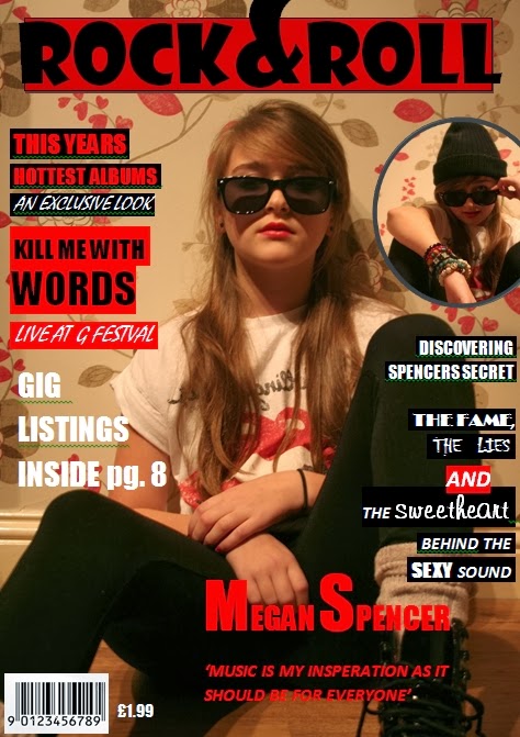
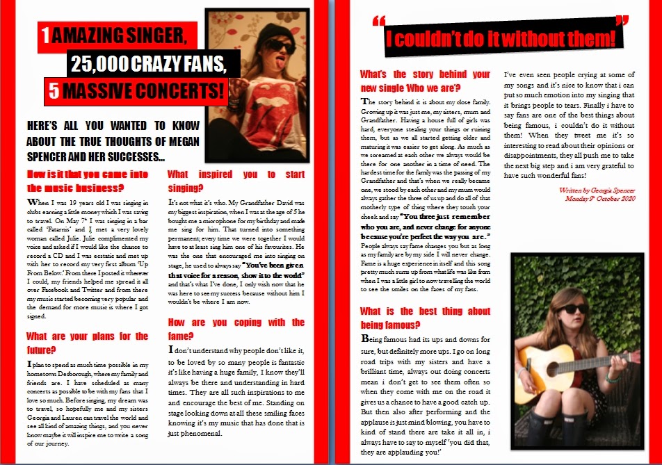
Friday 21 February 2014

OCR G322 – Cranford (Class)

OCR G322 – Cranford (Class)

The representation of class is highly shown through outfit. At the beginning we are introduced with a tracking shot of peasant boy, they have show him as a peasant by having him with bare feet and dirty clothes with holes in them, his outfit is much slimier to a slaves outfit symbolizing that they are in the power of other people and live in such conditions just trying to survive. He is clutching a bag of food to his stomach to show that he is practically clinging on to life; this is how precious a small bag of food is to him and his family, it’s a matter of life or death.

A long shot shows a little log cabin in the woods which can be related to the ‘Three little pigs’, it’s symbolizing that it’s weak compared to the brick mansions of the rich and even though it’s vital it is so easily taken away from them and then they go to the rich begging for help, symbolizing that rich always have the power.
A close up of the old second hand boots and a close up of the boy’s face have been edited together back and forth between the two, to show that something as little as that can mean so much, this showing the class well as the poor appreciate what they are given. It also symbolizes hope, his feet were bare and venerable but now they are covered and protected.  A close up shot of the father pointing to the boy as he says ‘We do fine without’ which is to do with education as people of that class don’t have that luxury.

A long shot of a huge white mansion, the white connotes heaven, a place that will bring the boy happiness. The non-diegetic music is a slow and deep sound suggesting something bad is going to happen and it’s building the tension.

Close ups of all the different types of fruits with the non-diegetic music of hearts and flutes which connotes Paradise, it’s like the donkey with the hanging carrot, and he wants to try theses delicious looking fruits but he knows he can’t have it.

Introducing the higher class is with a low angle shot of a man in a pair of expensive brown leather boots, the complete opposite of meeting the lower class boy showing the difference between them. It snaps into a mid shot so you can see the man’s expensive, well tailored and clean clothes, yet again the difference from meeting the boy.  

They have done a tracking shot of both classes together showing binary opposition of Rich vs. Poor as he drags him by the ear to his office. They have angled the shot upwards when focused on the man to show that he has more power and then the opposite for when the camera is on the boy to represent that the higher class are in charge of the poor because they have more money.

They represent the higher class not just through their clothes but the was they talk, a two person shot of a higher class man and lady saying such things as 'My lady' show they are of a higher class.


There is a scene where the posh man is having people set up a tent for a party, they have edited shots together that swap from woman in dirty maid outfits scrubbing the floor to formally dressed butlers carrying flowers showing that the poor get the horrible jobs because they will do anything for money as its vital for them to survive whereas the people that have money have the pleasant jobs. The non-diegestic music in the background is very upbeat and happy representing it’s going to be a fine evening.

The editing snaps between the different classes at mid shots as the man asks the boy to collect some ice cream and the boy replies ‘what’s ice cream’ which is representing his class because when you are poor you only have enough money to buy food and not fortunate enough to have luxuries.

We are shown a scene of the higher classes getting into horse and carriages showing that they don’t even have to walk to places where as the boy was walking around bare foot.  

Bedlam Production


Thursday 20 February 2014

Film Questionnaire

Questionnaire


Age:               Gender:

1. What is your favorite genre of film?
Horror   Drama   Comedy   Action   Sci-Fi  Musical   Romance      
Other (please state)_____________

2. Why do you watch films?

3. Do you judge a film within the first few minutes? If so, what do you judge them on?

4. What is your favorite film? Why?

5. Do you go to the cinema? Why?

6. When a film is released how will you watch it?

7. What is it you like best in a film? E.g. Story line, make-up, special effects e.t.c

8. Do you watch films for the actors performing? Why?

9. Do you prefer fiction or non-fiction? Why?

10. Does the length of the film effect whether you will watch it or not?

1. 16/Female

1. Rom-coms
2.For entertainment
3. I judge them on the opening scene how fast the pace Is and the music (If It fits the genre of film)
4. Snow White and the Huntsman because I like the fact It has a lot of action In It and there’s some romance, danger and a fairy tale involved too.
5. Yes I do because I like the whole experience.
6. Cinema If possible but If not then I will stream It.
7. The chemistry between the actors/actresses and how well the film flows.
8. Yes sometimes If I like the actor I will most likely like the film better because of who they are.
9. Fiction because It’s not real and you can only see It In a film and I prefer fictions as they capture my attention more.
10. Not if I enjoy the film the length of the film won’t matter


2. 17/Male

1. Sci-Fi
2. Watching films Is a main hobby of mine, I like to talk about them and I like to research about them once I've watched them.
3. No I have to watch It for at least an hour before I judge it
4. If I had to choose one It would be avengers assemble because It’s really interesting, It has a great story line, It’s all superhero movies coming together and Its special effects are amazing
5. I got to the cinema quite a lot because I think It gives It a better atmosphere, I’m not a huge fan of 3D though.
6. If I really want to see It I will go to the cinema and when Its released I would either stream It or buy the DVD
7. I like the story line, and films that really try and make you think, such as ‘Inception’, I also think one of the main things I like about a movie Is a good end scene, I think this makes the movie.
8. Not always, but If I hear that the film has an actor I like In It then I’ll watch It but If the trailer looks good anyway I will watch It.
9. I prefer fiction because It makes the story line more interesting as It Is really different to reality! It’s not something you see every day, such as a man swinging about In real life.
10. Not at all, I slightly prefer loner films If I’m honest because they have a more prolonged story line.


3. 16/Female

1. Comedy
2. Normally out of boredom, watching films is a nice way to escape
3. No, I judge it on everything as I think you need to witness it all in order to create a judgment
4. I don't have one as I think there are so many good films out there it is hard to choose one
5. Sometimes I go with friends, I see the cinema as something to do on a day out with someone
6. Depends what film, it it's really goo then cinema but if it's nothing special i'll wait until it's out on blue ray
7. Story line is the best as it's the main part to a film if there is no story line then there is no film
8. No, because it's not just the actors that make a great film 
9. Fiction because you can make the story line better
10. No, if it's a good film then its OK but it it's boring then it's a problem.


4. 12/Male

1. I like to watch Comedies and Animation.
2. I watch films for entertainment 
3. Sometimes, if it's confusing at the start I think its going to be slow for me as I don't understand.
4. My Favorite film is 'Yes Man' as it is hilarious and entertaining.
5. I go to the Cinema on special occasions such as birthdays and family days out. 
6. When they are released I would stream it.
7. I like the story line, effects, make-up and the actors.
8. Yes, sometimes I watch the films because I know the actor and know that they are good, and since I enjoy their other films I'm most likely going to like their new one.
9. I prefer fiction stories because he story line is made from scratch and more interesting then real life stories. 
10. The length doesn't really bother me unless I don't like the film, then i'll turn it off.


5. 71/Male

1.I like films that are based on a good book venturesome romances even musicals.
2. Mostly just for entertainment.
3. No because I always look at the reviews before I go so I know that they'll be good.
4. I don't have a favorite film, I like many.
5. Yes, I go regularly, I receive emails from the Odeon so I know whats on. I discuss with friends and we go together.  
6. I will see them at the Cinema.
7. I like a good strong story line something like the 'French Lieutenant Woman' or 'Captain Correlli's Mandolin.'  
8. Yes, i'm going to see a favorite actor, that way you know you can get a quality performance.
9. I usually go to fiction. But going to see one about Japanese prisoner's of war so my taste varies.
10. No, I quite enjoy a good long session.


6. 12/Female

1. I like Animation, Action, Romance Comedy and some Horror.
2. I watch films because they are very entertaining.
3. Sometimes I do because if I get confused at the beginning, throughout the film I'm not concentrating on the film but trying to work out what they are on about.
4. My favorite film is 'Zombieland' because It makes me laugh and everything about It Is just amazing.
5. Yes, sometimes I got to the cinema for special occasions because It's different from sitting at home watching it on a tiny screen. 
6. I mostly stream It or wait for It to come out on DVD or before It's released I will go to the cinema.
7. I sometimes like the story line, they a make up but mostly I like the actors In the movie as they are the 'things' that make It.
8. Not really because some actors have different parts in a film, In one they might be amazing but In another they might be really bad.
9. I prefer fiction because If I am watching a horror 
I would be scared If It was a true story.
10. Well, not really because if you enjoy it then it doesn't matter how long the films is.


7. 20/Female

1. My favorite genre is Horror.
2. I watch films mostly for the entertainment but Its also a great group activity.
3. I judge the quality of the cinematography and the likeness of the characters.
4. My favorite film is 'Resident Evil.' They're a spin off games i enjoyed playing when I was young so they're nostalgic, they're very well shot and staged with good actors. It's also a horror and I like a good horror especially with zombies.
5. No, I don't like them at all. I don't like being in big groups of people as sometimes they can spoil the film and i'm not a fan of the large screen.
6. I stream them because it's convenient and less costly. It can be done at a time that is beneficial for everyone you want to watch it with.
7. In terms of horror films (which I watch the most) I like the effects used I.e. make-up and general special FX. The story is also key in order to enjoy the film. I tend to prefer those that are realistic in their story line, but still interesting enough to keep me entertained.
8. Usually I do enjoy a film due to a particular actor being a leading role e.g. Hugh Jackman in the 'X-Men' series and Australia, George Clooney in the 'Oceans' films. However, collective groups in films such as the 'Expendables' are also good because it's a mass of fantastic male actors rolled into one film.
9. I like fiction films as they have a little more freedom in writing the story line, no restrictions to facts. This teds to make them more interesting and entertaining, as the writers can stretch their imaginative writing without limits.
10. If a film is longer than two hours it would need to be incredibly well produced and engaging in order to keep my interest. Films such as 'The Lord of The Rings' or 'Transformers' do this well due to their incredible FX and busy scenes of war and engaging with the enemy.

8. 17/Male

1. My favorite genre of film is Action.
2. I watch films to pass time and to entertain my friends when they come round.
3. I judge them on the first few minutes as it can give you an idea of how the film is going to go and who the main actors are going to be. I judge it on how much action is in and if there will be and funny moments.
4. My favorite film is '2 Fast 2 Furious' as it is one of the best in the franchise as it has humor, actions and my favorite actor Tyrese Gibson.
5. I go to the cinema when my friends ask me to see films with them or  to see a film that i can't wait for the DVD to be released.
6. I try and find a good film and stream it and if there is not one i will then go to the cinema.
7. My favorite element of a film is the special effects as it gives it more action.
8. I will watch most films because of the actors in it because if they are a good actor or are funny you know the film will be good.
9. I prefer non-fiction as i like the realistic element and the film is more believable.
10. Yes, I do not get much time to watch films so if the film is too long and I won't be able to finish it in time i will not start watching it.


Wednesday 22 January 2014

Final Front Cover, Contents and Inside Pages

Final Front Cover, Contents and Inside pages


Front Cover
This is my finished front cover, after doing my research I have targeted my magazine for teenagers as they are the most likely to purchase one. To appeal to my target audience, I also got from my research that the music genre that I should do is Indie rock as it is the music group that has been most popular recently. I have portrayed this music group by dressing my 'celebrity' in a trending fashion called 'Indie' that consists of band shirts, boots and an overall cool and laid back look. I thought this would be a good selling point as teenagers can relate to this celebrity and I have also used the gratification theory, so when girls see this young model they will want to be like her. Also she isn't just selling music but being a fashion icon so this magazine has a wider range in readers.

When thinking about creating my Mast Head I wanted something that would be short and easy to remember but also recognizable. Rock and Roll is a music genre that has been around for many years and there isn't a person who hasn't heard of it, so I thought this would have been a good Mast Head. Even though my magazine isn't aimed for the older ages because it is a music group that has appealed to many ages, that all ages would have a look to see what new Rock and Roll there is.

I have gone for the colour scheme red and black as they are the colours most of the older rock bands have used e.g. The Rolling Stones, so yet again it would be a good way to keep everything representing the genre of music. Them two put together also make good contrast and become very eye catching.

As I have a  patterned background, I had to put a block behind the Mast Head as I didn't want it to blend, so if I was to do this again, I would have taken my image on a plain background.

I used a very bold font to keep it eye catching and it really makes it stand out on the page. For my copy I completed a significant amount of research to see what kind is written on the front of a music magazines and it was mostly to do with concerts and new songs and albums coming out. They also advertise new bands on the front to help them get heard, so I took all this in to consideration when thinking about the information I was putting on the front. As you can see it is all to do with gigs, festivals and bands. I kept them short but interesting to the readers. People are very nosy and are very interested about finding out things about peoples' personal life, so I gave a little bit about what the interview was about but not too much that there is still some mystery.

When getting ready to take my photo for the front cover I purchased several music magazines to get an idea of how my 'celebrity' should be positioned. They were all very similar, if it was a band I would have a mid-shot of all of them in some sort of standing position. However, the people on their own are in all different kinds of shots and positions so that gave me a chance to be creative. I chose to have her in a slouched sitting position as it made her look very carefree and laid back, this would be good idea as the music group I am representing is very chilled out. Also I had to think about having a good image and also have enough space to have my copy, and I did well with this as there was plenty of space to play about with and try different kinds of fonts and sizes. Although I would have moved the camera up a bit more to give me some more space to put a bigger Mast Head. Having a patterned background caused a few problems for me as it was hard to find a colour and a font that didn't blend in so I did have to highlight most of it, this wasn't too bad as it goes with the colour scheme and if anything, helps make it look more like a magazine cover. 

Contents
After purchasing a variety of different music magazines and looking at the contents I had put a list of the different conventions that were always included. They all had very similar thing such as sub headings, they make it easier for a reader to find what it is they want from the magazine - if its whats in this issue or if it' in every one. Contents are also linked to the front cover, they tend to have the same colour schemes and also it is common to have the biggest image linked to the front cover. There is always a lot of writing in small basic font.

When taking my images I really had to make them look appealing. To represent my 'Styles' page I took a picture of some Vans, theses shoes are a very popular brand and I thought that this would spike interest because that fact they are so well known. Fashion is a huge thing in this day and age so I thought that it would be a positive selling point as teenagers are always looking for new styles to wear and since my target audience is for teenagers it will be a popular page. However, I tried to make this magazine for both genders but this particular addition has turned out to be more appealing for females.

My 'Where's B & Zoe?' image is very basic but also effective, they are supposed to be people that are a big part of the magazine, they are always in it with a page about venturing around seeking new and amazing bands, like I said with the Oscars, teenagers are always looking for new music and this is a great way of finding new tracks.

Finally 'Megan Spencer' is the main focus, as you can see it has the biggest picture, this is because for this particular addition, she is the 'center of attention' and probably the reason why most people purchased the magazine. The image on the front cover was showing her cool and sexy side and the one I have used in my contents is more of a fun side of her which again is drawing the reader to find out more about what she is like.

As you can see I have stayed with the colours red and back as it help creates synergy, it links the front cover and the contents well, I have also used one of the fonts from the copy, again linking it with the front page.

Inside Pages
For my inside pages I wanted to keep with the synergy, so the images are from the same photo shoot, however because the interview shows a different side to her I put a more 'natural' picture so the readers can picture her as they read but I kept her 'stage' style. I have carried on using red and black and have used a bold font from the cover to create house style and synergy.

My aim for my inside pages was to go with the stereotypical set out of an actually magazine. The stereotypes consist of having the writing set out in a justified style as it makes it look a lot neater and more professional, its also very common in written pieces such as newspapers. The questions and answers are in columns on the page because it allows you to write a certain amount of information with it looking neat. I have enlarged some of the important parts of the text as I thought that they will catch the readers attention and spike their interest which will make them continue reading. I have also enlarged the beginning letters of each answer as it makes it look that little more professional.

My media product is for the target audience of teenagers that like Indie Rock. All the red on my pages connote love and passion, love and passion of music, singers, band members and fans. This magazine is for the girls that look up to Megan as a role model, hearing her story of how she came to fame and what she done in times of need. Megan's picture in the contents connotes that you don't have to be serious and cool as she is shown on the front, but crazy and weird. For the readers that are looking past Megan, there is so much information of all different kinds of music and gigs, it influences younger people to start getting out and experience festivals. 

If there was a company that was to distribute my magazine it would be 'Bauer Media Group'
as they publish a various of different genres. They produce the magazines Kerrang, Mojo and Q magazine. They operate in 15 country's  and they only like to do genres that are popular so since Indie Rock has become so very popular recently I think my magazine would strike their interest. Their target audience is also aimed at young adults so having that in common it also another reason as to why this company would be well suited for my magazine.

I have learnt a lot about technologies from the process of constructing  my product. When taking my image I used a Canon 550D, because of the lighting and the enclosed space, I had to learn what kinds of settings was needed, so as much light could be captured and I had to learn about aperture so I could make sure everything in the shot was in focus and nothing was blurred. Once I had chosen my final image, Microsoft Word helped out hugely. I learnt how to group everything I had on my page together to create one final piece and everything. I also learnt about all the different fonts, sizes and that you could highlight certain words that you wanted to stand out. All of theses helped with the completion of front cover, contents and inside pages. 

Looking back at my product I have learnt that detail is very important, when taking you image you have to think about clothing, body language, facial expression and mise-en-scene because you are representing you genre and you have to do it by your image, font and colours. I have also learnt that you have to really think about who your target audience is and how you can relate to them in the magazine. I have learnt the correct way to set out the copy and the mast head and way in which will grab the readers attention to your magazine such as the triangle where you create a triangle using the same colour. All of theses techniques have allowed me to create my final pieces.

Friday 17 January 2014

Final Magazine Front Cover


First Draft: Magazine Front Cover

This is the picture I've chosen, the reason I have chose this picture is because she is representing herself and the music genre we do well, she is sitting in a slouch position looking very laid back and chilled out which is what her music is like, her glasses are cool and fashionable like she is and she is wearing  DM boots that represent the music groups we also do. Then they clothing is white and black leaving the question 'Is she a saint or a sinner?'


This is my first draft of adding a Mast Head and Copy


Target audience and a selection of pictures of my front cover

Looking over the information I had received and the information I had found online I have decided I am going to do a magazine on the music group of Rock and Roll as this generation has a sudden liking to listing to the older bands and because this has become a new thing there aren't that many magazines that represent this genre of music. Then I read about the age groups that are most likely to purchase a magazine and it resulted in 13-17 year old. So my target audience is going to be for teenagers. As teenagers are at that age where they cant work or work and only get a small pay check I thought id make sure I put plenty of chances to win things and something free with it.

So with the information that I needed I started to take pictures for the front of my magazine.
I have used a my sister Megan and I have dressed her up in a style of clothing that would be called 'Indie' and I did this because this is the stereo-type clothing for the people that listen to Rock, it is also a popular style of clothing that is trending so it also might draw attention to people that haven't head of 'her'. Megan is a new singer that has became very popular and I have used her on the front as she is new people are going to want to find out more about her and when she is going to bring out new music so I thought that this would be a good selling point.

When taking the pictures I thought about space to put the copy, lighting and colours so it's clear and eye catching and also appealing to look at. I also wanted to use sex appeal, as it is a female singer I didn't just want girls to buy the magazine, so if she looked appealing then it would also attracted the males.